Journal 16.1
We speak our own design language here at Polestar. It lends our products an accent that makes them instantly recognizable. And like all languages, it's ever-evolving.
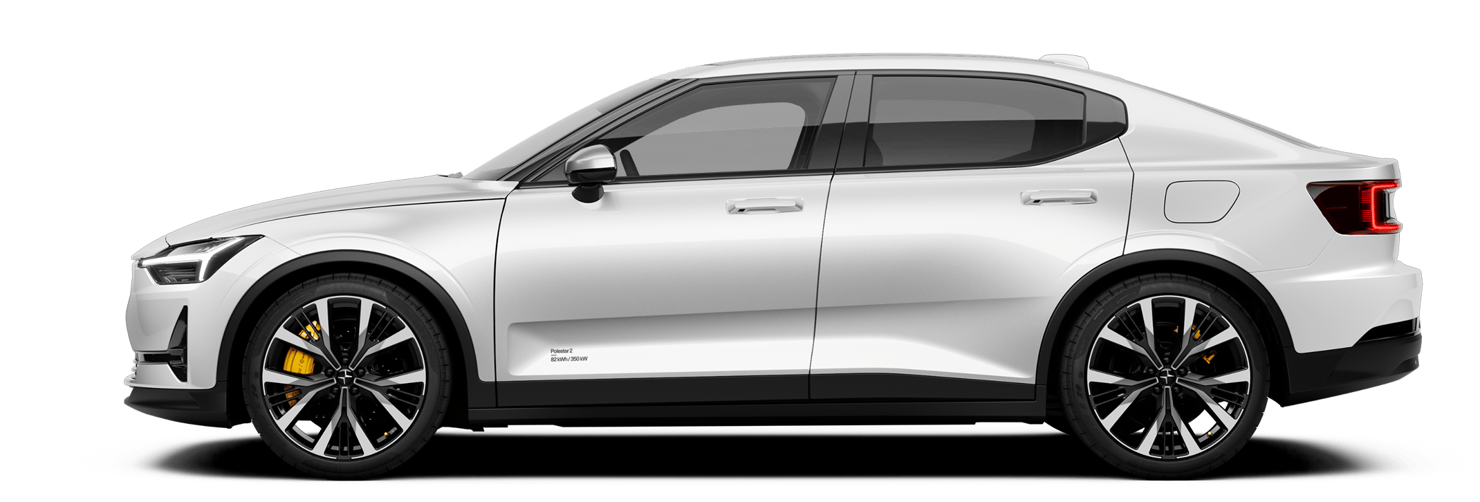
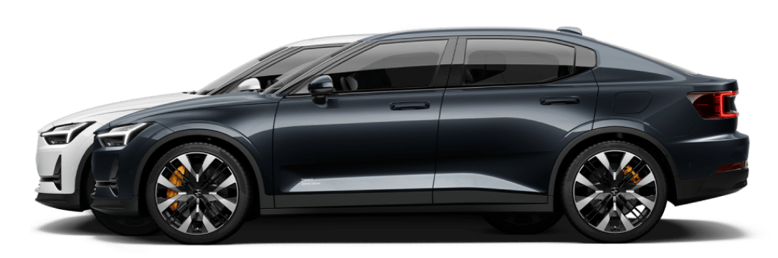
Polestar 2: design deep dive
The Polestar 2 is the latest version of the Polestar design language, with its own distinct features: carefully curated colour combos, deliberately chosen materials, closed lines, single folds creating tension, high contrast between pure surfaces and graphics which are almost architectural, and more.
Here's the thing, though. When it comes to the Polestar design language, we're native speakers. It's no secret what we think of it. What we wanted was an external perspective; someone who doesn't have the Polestar aesthetic vocabulary already at the front of their minds, who could share their thoughts and opinions. However, we couldn't just ask anyone. We wanted to speak to someone who is familiar with design language, even if ours is one they haven't heard yet. An interpreter of the aesthetic. A design linguist.
Sam Livingstone is one of those people.
A car design strategist, consultant, and the director of Car Design Research, Sam Livingstone is exactly the person we'd like to hear from. Someone from outside the Polestar universe who nevertheless understands the subtleties and nuances of what our design is communicating. In other words, Sam speaks our language.


“It's a fairly serious design aesthetic, it's not whimsical,” he opens with when asked about the overall look of the Polestar 2. “It's quite strong and rational, while still being minimalistic. It's quietly distinctive, it's not a 'look at me' car.” Livingstone contends that a lot of existing brands are increasingly pushing a more “emotional” aesthetic, and that the relatively strong surfaces and tough silhouette of the Polestar 2, combined with subtle details, offers something new and unique.
“It's controlled and cool in its aesthetic, but what's nice is how that's offset once you get closer to it and see the smaller details,” he states. “Those subtle, discreet things reveal an underlying sensitivity which is rather beguiling, like the glowing Polestar symbol which is literally hidden overhead, which you only see as a reflection on the roof glass.”
Another detail which caught Livingstone's eye was the symbol treatment on the car itself. Matching the exterior colour rather than being chromed-out, and without any accompanying model nomenclature, the Polestar symbol occupies its place on the car with subtlety. “To not have those ingredients which conventional wisdom says you have to have there, and to have the confidence to do away with them, is a very admirable quality.”


"It’s quietly distinctive, it’s not a ‘look at me’ car."
Minimalism has always formed the core of the Polestar design language. The lack of clutter serves to highlight both the broad strokes, and the details that remain. One of the aspects which is pushed to the fore is the silhouette of the Polestar 2. A fastback possessed of its own unique proportions, Livingstone feels that this is one of the more immediate impressions that one gets upon seeing it for the first time. “It's taller than other fastbacks, with a toughness that's belied by its form language,” he states.
“It borrows elements from the coupé and the crossover, combines them in a unique way, and it's then galvanized by being a Polestar.” Elements such as the above-mentioned taller stance and the face of the car, which is “assertive without being aggressive, communicating that this car means business.”
“It’s quietly distinctive, it’s not a ‘look at me’ car.”
It's not just the design which is minimal. The available colours and materials for the Polestar 2 are curated; you'll have to look elsewhere if you want a car in Vegas Sunset orange with Louis XIV purple velour interior. This has a twofold effect: it guarantees that all material and colour combinations work, but it also lends the Polestar 2 a certain accessibility. “It's not all of a sudden a different vehicle once you step inside,” states Livingstone. “The colours, the materials, the lack of chintz, this is a car that's very comfortable for anybody, being accommodating to them instead of demanding upon them.”
These are but a selected sample of what Sam Livingstone had to say concerning the design of the Polestar 2 (the rest of which can be seen in the above video). And what we heard was gratifying. It's one thing to communicate using a language that you're familiar with. It's another thing entirely to see that someone else understands what you're saying. That someone else gets it.
Seems like Sam gets it.


